How to Choose Opaque Stained Glass Sheets?
Opaque Stained Glass Sheets can bring color and privacy to a window, cabinet panel, or decorative partition. Yet “opaque” does not mean every sheet blocks light in the same way. Some diffuse daylight softly; others create a dense, almost solid field of color. The right choice depends on the room, the viewing distance, and the effect you want after installation.
Color theorist Josef Albers wrote, “In visual perception a color is almost never seen as it really is—as it physically is.” That principle is useful when comparing stained glass. A ruby sheet may look deep under shop lighting, then glow brighter against a sunny window. A blue sample may shift beside warm wood or cream-colored walls. Look closely at texture, thickness, and surface variation, too. Small ripples can make a panel feel lively, but they may distract in a clean, modern setting.
This guide explains how to compare opacity, color, texture, and light transmission before buying. Hold samples against the actual opening at different times of day. Check both sides. Test it first. A product photo cannot show every variation, and even a careful sample may not match a full sheet perfectly. That uncertainty deserves attention. By considering your design, lighting, and cutting needs together, you can choose Opaque Stained Glass Sheets with clearer expectations and fewer costly surprises.
Understand the Types and Properties of Opaque Stained Glass
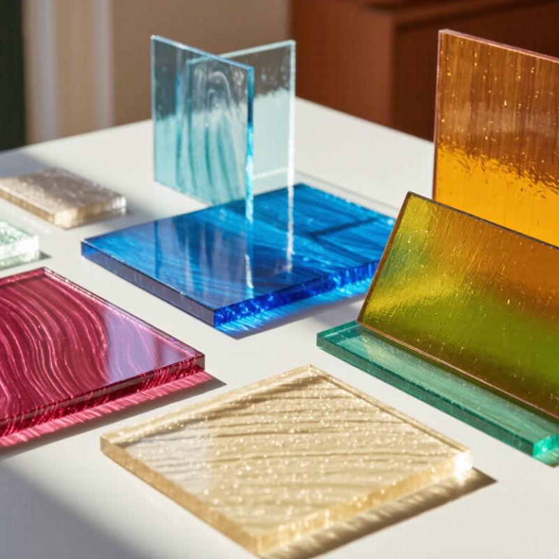
Opaque stained glass blocks most direct light, but “opaque” is not one uniform finish. Some sheets are dense, with little light passing through; opalescent sheets have cloudy areas that soften the glow. Streaky or mottled sheets mix opaque color with translucent bands. Hold a sample near a window: its edges may glow even when the center looks solid. Texture and thickness also affect how color appears, especially in small pieces. Color can shift.
Match the glass to the purpose. A dense sheet can conceal a backing or create a bold, quiet area in a panel. Opalescent glass adds depth without offering a clear view through it. Check both sides in daylight and under indoor lighting; warm lamps can change how reds and creams appear. Inspect for bubbles, surface ripples, and color variation. These may be intentional, but they can interrupt a precise pattern. One sample is rarely enough for a large project.
Tips: Ask for a cut sample from the same sheet or batch, then place it beside your leading and grout colors. Test a small offcut before cutting the full design. Handmade variation is part of the material, and sometimes it surprises you.
Define Your Project’s Color, Size, and Light Requirements
Start with the room and the job the glass must do. A deep blue panel can look nearly black against a shaded hallway, while the same sheet may appear brighter beside a sunlit window. Color shifts. Request a sample, then view it at the installation site in morning and afternoon light. Check the manufacturer’s color description and thickness, but judge the actual sheet too; batches and surface texture can affect appearance. That choice is easy to misjudge.
Measure the opening before ordering. Record both the visible area and the space needed for the frame, came, or edge finish. For a small cabinet door, a slight measurement error can leave an awkward gap. Light matters as much as size. Opaque glass is intended to obscure views, but it can still reflect light or glow at its edges. The U.S. Energy Information Administration’s 2018 Commercial Buildings Energy Consumption Survey reports that lighting used about 17% of commercial-building electricity. This is not a stained-glass performance figure, but it is a useful reminder to consider how the panel interacts with room lighting. Test it in place. If privacy is essential, inspect the panel from both sides under the lighting you expect to use.
How to Choose Opaque Stained Glass Sheets
Compare example project areas to estimate how much glass you may need.
Planning examples: Areas are calculated from the example dimensions shown (width × height); measure your actual opening and allow for cutting waste. Choose colors to suit your design, and check a sample in the intended lighting—opaque glass obscures clear views, but the amount of light passing through varies by glass.
Compare Sheet Colors, Textures, and Surface Finishes
Opaque stained glass is not simply “more colorful”; its surface changes how color reads. Compare samples beside a white card and under the same daylight. A deep blue may look nearly black in a shaded corner, while a pale amber can appear warmer near a lamp. Check the sheet from both sides. Texture can scatter reflections, soften outlines, and make small color differences less obvious.
Ask suppliers for spectral color or light-transmission measurements, not just names such as “ruby” or “opal.” CIE 15:2018 describes standardized 2° and 10° observer methods for color measurement, helping make technical comparisons more consistent. ASTM C1036 also sets quality requirements for flat glass; it is useful context, though it does not rate artistic color. Compare thickness, visible bubbles, and surface uniformity in person when possible. A photo cannot show every flaw, and I would not treat it as a perfect preview.
Tips: Place two or three sample sheets over the same printed line. Note how much detail disappears, then rotate each sheet to check glare and texture. Record the viewing light, too. Small changes matter. For a larger panel, inspect a full-size mock-up before ordering; even careful selection can miss how a finish looks across a broad area.
Assess Glass Quality, Thickness, and Compatibility
Opaque stained glass can look uniform in a product photo, yet vary noticeably in daylight. Hold a sheet near a window and check whether its color stays even across the surface. Small bubbles or streaks may be normal, not flaws. Look for cracks, sharp chips, and cloudy patches that interrupt the pattern you need. A sample piece helps. Compare it with your design under the room’s actual lighting, since warm indoor bulbs can shift how a color appears. It is easy to overvalue perfect color; a little variation may suit a handmade panel better.
Thickness matters as much as appearance. Measure the sheet with calipers if the fit is close, then compare it with your came, foil, or frame specifications. A sheet that is too thick may resist fitting; one that is too thin can leave a loose, uneven joint. Check compatibility before cutting. For a mixed-glass project, test a small offcut with the same assembly method. Different textures and thicknesses can make a panel harder to align, even when each piece looks suitable alone. Suppliers may list approximate dimensions, so confirm critical measurements rather than assuming every sheet matches exactly.
Choose a Supplier and Estimate the Amount Needed
When choosing a supplier for opaque stained glass sheets, ask for exact dimensions, thickness, and a written description of the color. “Opaque” can still allow light through, and samples may look different under workshop lighting. Request a small sample from the same production batch if color matching matters. Check how sheets are packed, and ask what happens if glass arrives chipped. Small details matter. Confirm current stock and delivery timing before planning a project; a delay can leave a partly finished panel on the bench.
Estimate the glass area from your pattern, not just the finished panel size. Measure each shape or divide a simple design into rectangles and triangles, then add the areas together. Allow roughly 10 to 15 percent extra for cutting waste, especially with curved pieces or a first attempt. Complex patterns may need more. Include a spare piece if the design uses one prominent color, since a replacement sheet may not match exactly. Keep your measurements beside the order. A tidy calculation can still miss narrow borders, test cuts, or a piece that breaks; review the pattern once before buying.